You are viewing the Articles in the Browsers Category

Invoking Native Mobile Applications with URI Schemes

In a previous article, I outlined how the native iOS Keyboard and it’s behaviors can be managed with HTML5 input types. In addition to this, iOS, Android and most A-Grade Mobile platforms implement standard URI Schemes (or parts thereof), which allow for easily launching native applications.

URI Schemes

When considering URI Schemes, more commonly (though incorrectly) referred to as protocols, one typically thinks in terms of the more ubiquitous schemes: http, ftp, file, mailto, about, data:uri and so forth. However, as with these and other common URI Schemes, there are additional schemes which allow for various practical applications in the context of Mobile Web Apps; the most common of which being the ability to invoke a platform’s native phone or messaging application, respectively.

URI Schemes and Mobile Devices

In the context of Mobile Web Applications, the tel, and sms URI Schemes are perhaps the most common and applicable; providing a simple means of invoking their corresponding native applications. The following are basic examples which work across all major mobile platforms.

The tel URI Scheme

The tel URI Scheme allows for launching a device’s native Phone application in the context of the phone number specified:

The sms URI Scheme

The sms URI Scheme allows for launching a device’s native Messaging application to send an sms message, or to send an sms message to the phone number specified:

As can be seen in the above examples, hyphens are used in the same manner as one would typically specify a phone number; however, use of visual separators are purely optional – they can be used to aid in readability if desired, but are otherwise ignored when parsing the URI.

As a general best practice, one should take care to ensure both tel and sms URI Schemes are defined in lowercase, so as to ensure portability across platforms. Additionally, it is important to note that the sms scheme is not implemented to completion against it’s formal definition on any platform (see section 2.2 of rfc5724); thus, an sms message body, or sending an sms message to multiple recipients is not supported.

While there is nothing particularly ground breaking about these URI Schemes, or technically complex for that matter, they do prove to be quite useful in the context of Mobile Web Applications. As such, they are certainly worth noting as each can be leveraged to improve the usability of an application.

Styling HTML5 placeholder attribute text

HTML5 placeholder attributes can be leveraged to provide a convenient means of indicating required input formats.

By default, browsers typically implement placeholder attributes as light-grey text. As with all default user agent styles, one will feel compelled to define custom selectors to provide application specific styles to elements, placeholder attributes included.

Styling Placeholder Text

Styling placeholder attributes on input and textarea elements is rather simple; however, one should take care to keep style declarations limited to those of a textual nature; e.g. color, font-size, font-family, etc.

As it stands, HTML5 placeholder attributes can be styled with pseudo-elements in WebKit, and pseudo-classes in both Firefox and IE10; all of which (currently) require vendor prefixes.

Placeholder attribute text can be styled for all supported input element types (text, search, url, tel, email, and password) as follows:

As can be seen, defining styles for placeholder attribute text is quite simple, and such styles can be employed to add subtle enhancements to form elements in modern web apps quite nicely.

Natural Box Model Sizing

As Web Developers, the benefits to be afforded by simply taking the time to aquire a fundamental understanding of CSS layouts can not be overstated; for it is these very skills that provide the basis from which designs can be achieved with ease; making the task of designing the Web an enjoyable, and rewarding experience. Conversely, without an understanding of core concepts, one is certain to spend a significant amount of time – often in frustration – attempting to achieve a desired layout.

CSS Layout Fundamentals

In the context of CSS layouts, such fundamental concepts to be considered (in no particular order) include: document flow, positioning, display types, off-sets, floats, overflows, clears, and the like; and, as the title of this article suggests, the Box Model.

The Box Model

I emphasize the importance of the Box Model here in particular, as the default sizing of elements with respect to the Box Model is quite the opposite of what one might expect.

For example, consider the following:

As many would assume, any element with the .box class would render with a 1px border and 20px of padding, at exactly 200x200px. However, by default, this is not how elements are sized, but rather, the actual size of a rendered element is calculated to include both borders and padding in addition to width and height, the calculation for which essentially being:

This results in nearly all elements (form elements notwithstanding) being measured quite differently then one might have expected. Thus, in the example of the .box class mentioned above, rather than elements being rendered at the expected 200x200px, as defined by their respective width and height properties, they would instead be rendered at 242x242px.

.box content-box

One could argue that in the majority of cases, this is neither what is expected nor what is desired. Fortunately, CSS3 offers the very useful property box-sizing, which can be used to override the default sizing of elements (content-box), and allow for sizing them more naturally simply by setting box-sizing to border-box:

By setting box-sizing: border-box, elements with the .box class will render at the expected size, 200x200px, as defined by the width and height properties; with the content area being 158px, padding 40px, and border at 2px.

.box border-box

Box-sizing Global Resets

Paul Irish has a great solution for this very problem whereby a global reset is used to ensure all elements are sized with border-box. I highly recommend this approach as it provides a starting point from which all elements will be sized “naturally”. The reset is simple, safe, and works perfectly well in supported browser:

CSS3 background-clip and background-origin

The background-clip and background-origin properties, respectively, can both be used in tandem with box-sizing; each accepting the same values as that of box-sizing, allowing for related control of how backgrounds are displayed for elements with respect to the Box Model.

Concluding Thoughts

It was quite some time ago while trying to understand how the sizing of elements is determined in more detail that I first learned of the box-sizing property. In the time since, I have been using box-sizing:border-box with great results and have really come to appreciate this property.

And so, if you haven’t leveraged box-sizing: border-box in your designs yet, I strongly recommend giving it a try, as you will likely find it to result in more “naturally” sized elements.

Windows 8 Web App Start Screen Tiles

Having had to certify a Web Application for use on the HTC Windows Phone 8X, as well as the Microsoft Surface Tablet, I was interested in providing a Start Screen Tile similar to that of the application’s current iOS Web Clip Icon. Not the least, the new Tile Based UI in Windows 8 presents significant UX improvements over that which has been seen in previous versions of Windows; thus, I felt compelled to take advantage of the new UI from a Web Application context.

Conveniently, adding a Windows 8 Start Screen Tile (Pinned Site) can be accomplished quite easily, and in much the same way as that which is used when specifying a Web Application to run in standalone-mode on iOS. To do so, one need only add additional meta elements with a name attribute of msapplication- followed by a specific Tile property. A standard content attribute can then be used to provide the corresponding attribute value.

For example, a Tile can be defined with a specific color using msapplication-TileColor:

Likewise, a specific Tile image can be provided using msapplication-TileImage:

Note: Tile images should be 144x144px, in .png format (transparent).

This site, for instance, utilizes both of the above:

While creating and defining a Start Screen Tile is simple enough, Microsoft also provides a handy Web based utility which allows for automating the Pinned Site creation process by generating a selected Tile Image in the correct dimensions, and providing the corresponding source at www.buildmypinnedsite.com

Quick Tip: Chrome Developer Tools Shortcut Keys

Sometimes it is the more subtle, less obvious features provided by tools which prove to be surprisingly useful. Interestingly, while such features can save developers considerable time and effort, they are often much less apparent, and thus, occasionally overlooked when compared to their main counterparts.

A noteworthy example of some very simple, yet extremely useful features can be found in just a few of the basic Chrome Developer Tools shortcut keys. Below is a brief description of the most convenient shortcuts I find myself using regularly.

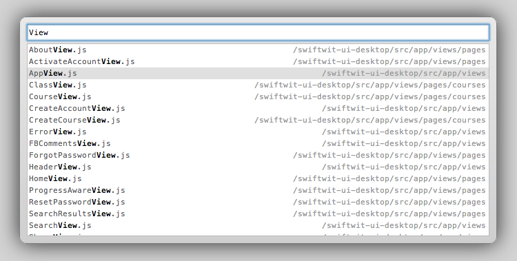
Go to Source (Cmd-O)

Perhaps the most useful short-cut available in the sources panel, Cmd-O allows one to quickly search for a specific source file (thanks to @augiemarcello for this one):
Chrome Developer Tools Command-O

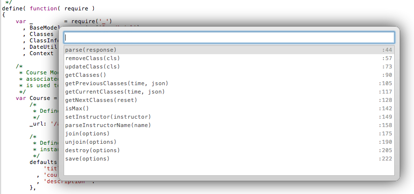
Show Functions (Cmd-shift-O)

Another extremely useful feature in the Sources Panel, Cmd-shift-O displays a list of all functions and their corresponding line numbers within the current source file:
Chrome Developer Tools Command-Shift-O

Clear Console (Cmd-K/)

Clears the console when in focus:
Chrome Developer Tools Command-k

Previous/Next Panel (Cmd-[ / Cmd-])

Toggles between Developer Tools Panels (e.g. Elements, Resources, Network, Sources etc.):
Chrome Developer Tools Command-[]

There are quite a few additional shortcut keys available in Chrome Developer Tools, and Jared has done a excellent job of providing a Devtools cheat sheet. I highly recommend trying some of them out; committing to memory those which you find most useful – and sharing them with others as well.

HTML5 Document Outliner

Recently, while preparing a training session on HTML5 Semantic and Structural Elements, I was rather intent on conveying the importance of an application’s overall markup and structure, while also expressing the importance of not being overly concerned with the absolute technical “correctness” of each and every element used.

With this in mind, providing a general overview of HTML5 sectioning content, and HTML5 Document Outlines, seemed appropriate points to emphasize.

Before doing so, I was looking to utilize a simple utility to provide a means of visualizing an HTML5 Document Outline, and the very useful Chrome Extension, HTML5 Outliner, proved to be an ideal tool for the task.

In particular, the HTML5 Outliner is quite helpful in validating the overall structure of single page web applications, whereby the constructed page is based on multiple disparate client-side templates being rendered at runtime; in which case it can be rather useful to have a holistic view of an application’s structure.

And so, if you are building modern client-side web applications, and using Chrome, if you haven’t done so already, I certainly recommend installing the HTML5 Document Outline for quickly viewing an application’s overall structure.